

POP's Candy Shop
Design Skills Used:
Background
POP’s Candy is a Pop Art inspired sweet shop that provides their audience with satisfying treats that will fulfil their cravings as well as visual elements which appeal to both young and old. POP’s Candy Shop reached out to me looking to refresh their brand. They were looking to make their brand further reflect this art movement theme while also having a modern look to help grow their audience.
Initial Research


Concept Development


Finalized Brand Elements


Problems and Challenges
The first challenge I faced with this rebrand was ensuring that their audience saw POP’s Candy as a quality product made with fresh ingredients. Another request POP’s Candy had was that the new brand would still have a nostalgic feel while bringing in new generations. The main design problem POP’s Candy shop was facing is that their old look did not reach their audience. This is why my goal for this design was to create a new brand identity. One that keeps the nostalgic feel but uses skills that follow new brand trends both in font choice and visual elements. While ensuring the brand honours the history behind the Pop Art movement.
Real World Application


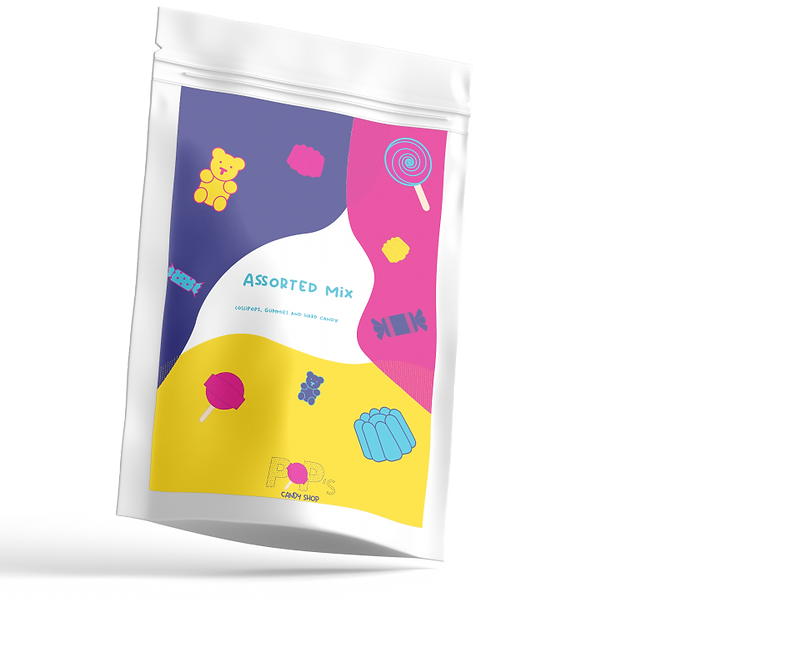


Results and Outcome
The brand refresh for POP’s Candy Shop has yielded remarkable results. The design successfully brought a vibrant and iconic aesthetic of the Pop Art movement into the core branding. The challenge between modern and nostalgia was effectively met, ensuring the shop remains loved by the existing audience while also attracting new ones. The candy packaging provides the audience with a clear sense of the brands quality sweets. In conclusion, the brand refresh has not only revived POP’s Candy Shop but energized the brand’s vibrant and engaging feel to make it a strong competitor in the candy industry.
